Project members
Emeritus members
Viz gallery
Computer systems
- Mobile networks
- Memory profiling
- Superscalar processors
- System monitoring
- Interactive parallelization
- Parallel systems
Relational databases
Links
Sponsors
Related Projects
* The Polaris Project has its own web page now. *
The Rivet Visualization Environment
Rivet is a general-purpose environment for the analysis and visualization of complex systems. Rivet is a powerful and flexible system, providing analysts with a single tool that can be learned once and applied to a wide range of problems.
The underlying approach in the development of Rivet is to understand and analyze the visualization process itself: to identify the set of fundamental visualization components, or building blocks, and define their interfaces and relationships. Users can then develop sophisticated visualizations by writing scripts that create and connect these basic building blocks. This approach, and the resulting modular architecture, provides several significant advantages:
- Extensibility.
- Each basic component type in Rivet is defined as an abstract base class in C++. Developers can add their own components to Rivet by implementing them as subclasses of the desired base class.
- Rapid prototyping.
- Because the components themselves are relatively simple and express a single aspect of a visualization, the components can frquently be re-used from one visualization to the next. In many cases, developers can create effective visualizations simply by writing scripts that mix and match existing components, without having to write any C++ code at all.
- Coordination.
- Developers can easily create coordinated multiple-view visualizations through the sharing of components.
Rivet includes a general data import mechanism, enabling the visualization of data from a variety of sources; in addition, it can directly connect to SQL Server and display data in existing relational databases. Rivet also provides an extensible data transform interface for manipulating and deriving new data, which effectively integrates visualization into the analysis process.
For more information about Rivet, see our paper in Computer Graphics 34(1).
Computer systems visualization
Computer systems are becoming increasingly complex due to both the growing number of users and their growing demand for functionality. Processors are more elaborate, memory systems are larger, operating systems provide more functionality, and networks are faster. This increasing complexity magnifies the already difficult task developers face in designing and using the new technology.
In an attempt to cope with this complexity, system designers have developed new tools which are capable of capturing the behavior of these systems in great amounts of detail with minimal intrusiveness. Examples include the SimOS complete machine simulator, SGI's Performance Co-Pilot, and Compaq's DCPI system.
Information visualization is a compelling technique for the exploration and analysis of the large, complex data sets generated by these tools. Visualization takes advantage of the immense power, bandwidth, and pattern recognition capabilities of the human visual system. It enables analysts to see large amounts of data in a single display, and to discover patterns, trends, and outliers within the data.
More importantly, an interactive visualization system enables analysts to retain the data provided by these rich data collection tools and navigate it in a manageable way. Beginning with a high-level summary of the data, analysts can progressively focus on smaller subsets of the data to be displayed in more detail, drilling down to the individual low-level data of interest. This exploratory data analysis and visualization process is succinctly characterized by Shneiderman's mantra for visual information seeking: Overview, zoom and filter, details-on-demand.
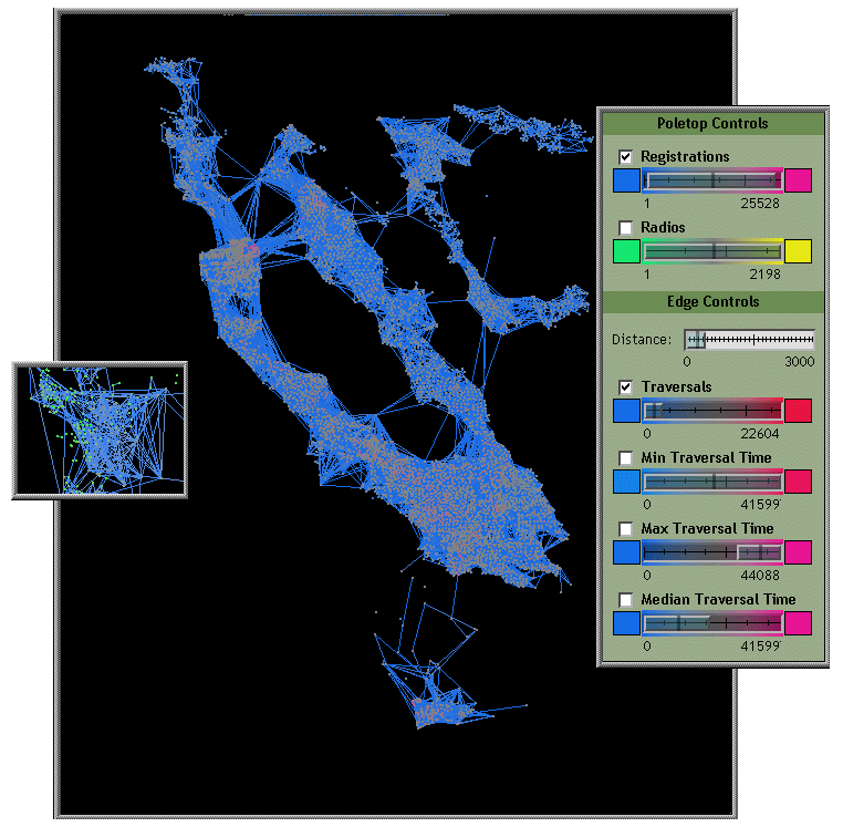
Mars and Metnet: Mobile network usage analysis
Studying mobile network usage patterns is important given the increasing number of people using wireless networked devices. Current research in mobile networking relies heavily on simulation; therefore, researchers need models of user movement based on actual observation.
To assist in the analysis, we integrated several data mining algorithms into Rivet and created an interactive visualization for configuring and displaying the results of these algorithms; they enabled us to categorize user mobility patterns and usage patterns over time. In addition, we created a geographic visualization showing overall network statistics by location. For more information see Diane Tang's thesis. |
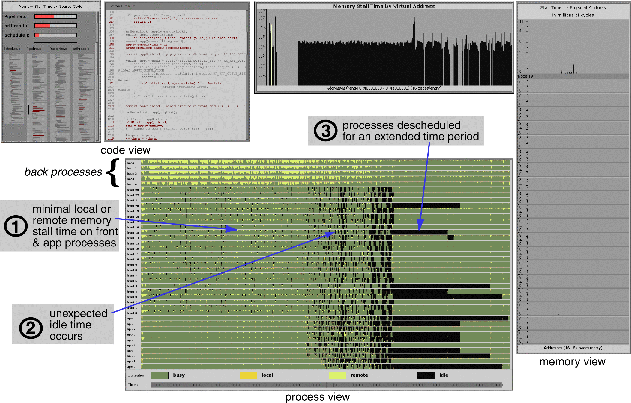
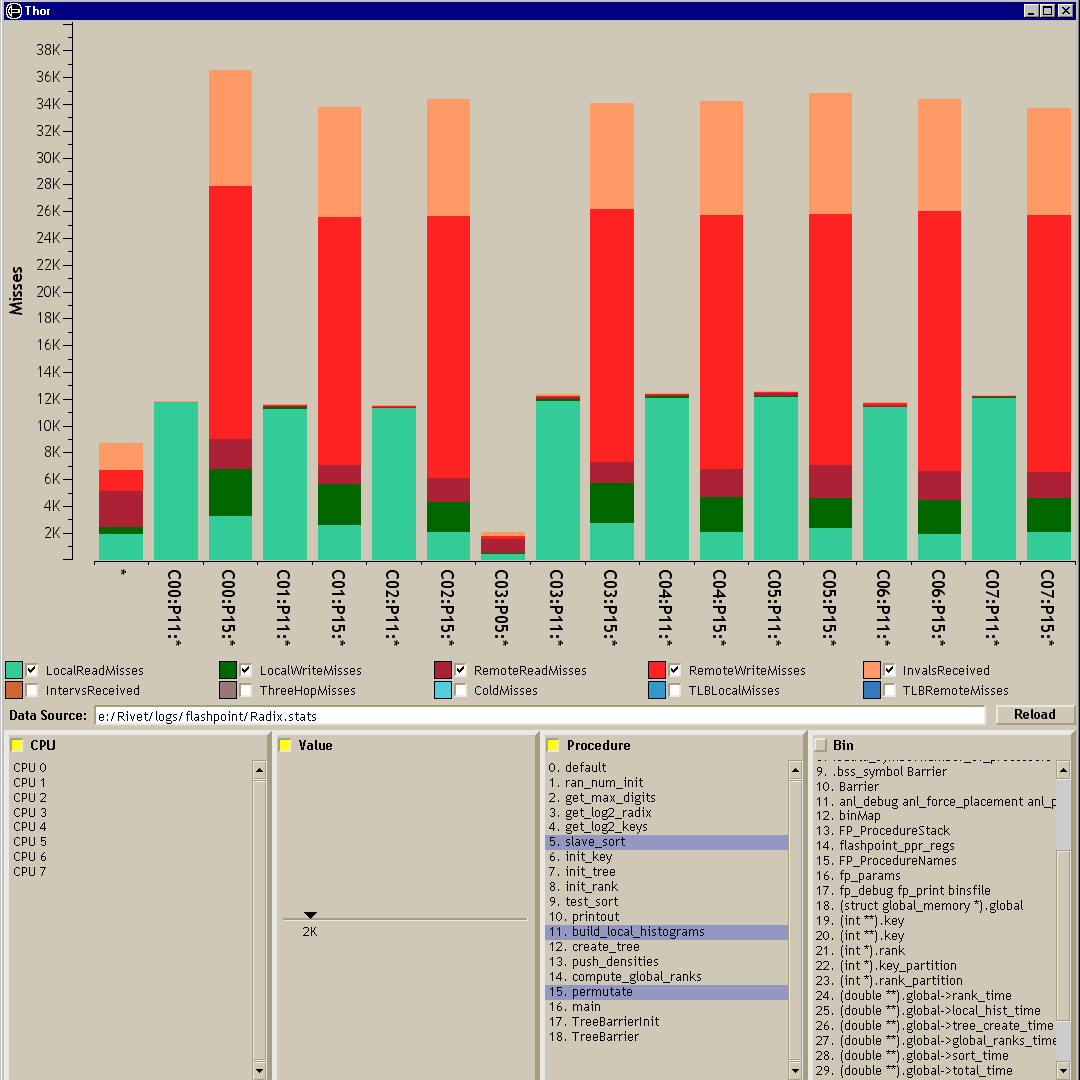
Thor: Detailed memory profiling
Over the years, processing speed has continued to grow at an exponential rate as described by Moore's Law. However, the performance of the memory systems the transfer data into and out of the processors has been improving at a much slower rate. Consequently, memory system performance has a large and growing impact on application performance; in fact, for many applications, it is the primary performance bottleneck. The Thor visualization presents detailed memory system utilization data collected by FlashPoint, a firmware memory profiler running on the FLASH multiprocessor. Thor employs interactive data filtering and aggregation techniques to enable users to drill down from an overview of an application's memory system performance to detailed displays showing memory requests for individual processors, procedures, and data structures. The primary benefit of this visualization is its support for interactive data exploration through the use of filtering, aggregation, and sorting; the visuals themselves, while unspectacular, succeed in presenting the data in a familiar format and enabling users to extract interesting and meaningful information from the data. For more information see Chapter 4 of Robert Bosch's thesis. |
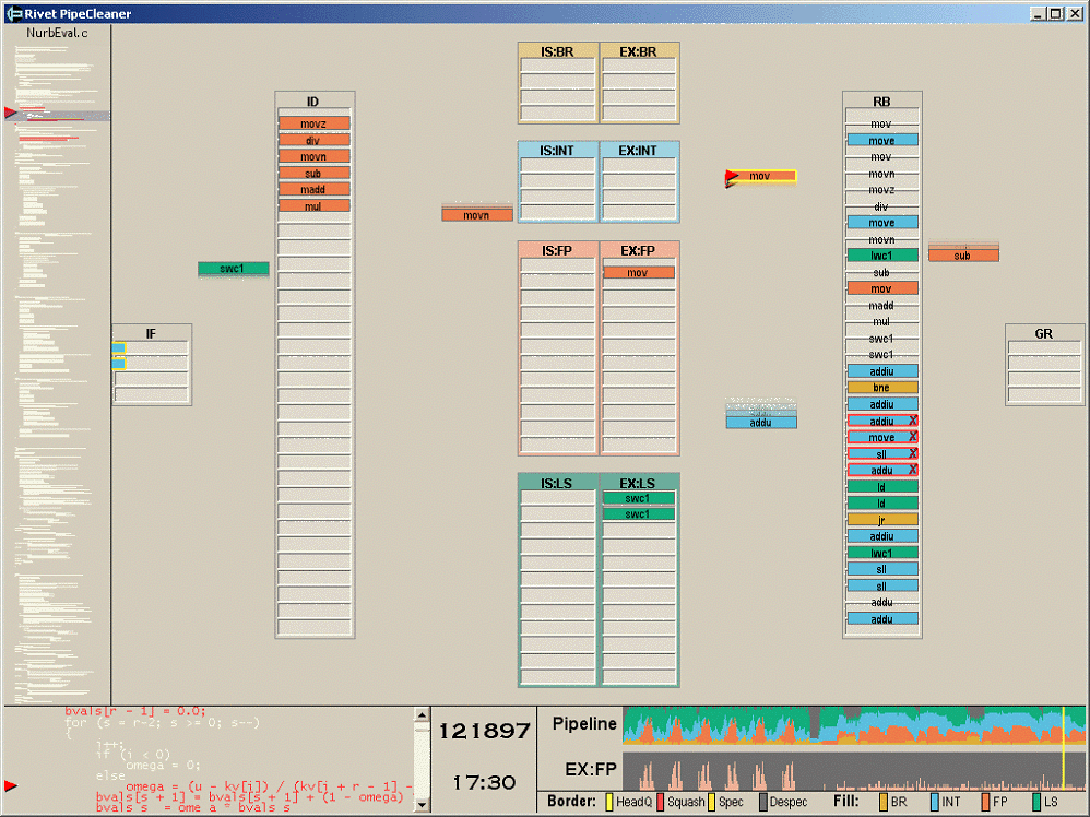
PipeCleaner: Superscalar processor analysis
While memory system behavior is an important component of computer systems performance, to run at peak throughput, applications must also be able to take full advantage of the tremendous processing resources provided by modern multiprocessors. PipeCleaner is a visualization of application performance on superscalar processors, the dominant processor style on the market today. The visualization is composed of three linked displays: a timeline view of pipeline performance statistics, an animated cycle-by-cycle view of instructions in the pipeline, and a source code view that maps instructions back to lines of code. These views combine to provide an overview-plus-detail representation of the pipeline, enabling the effective analysis of applications. PipeCleaner visualizations have been used for application performance analysis, understanding hardware design tradeoffs, and debugging of detailed processor pipeline simulators. For more information see our paper in InfoVis 1999. |
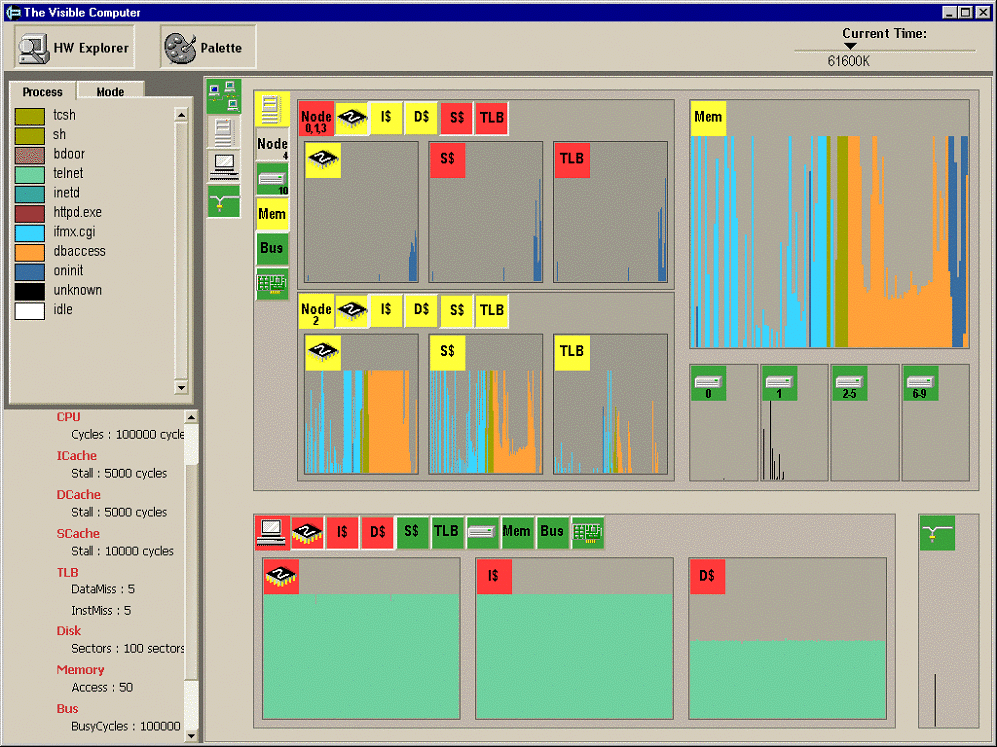
The Visible Computer: Real-time system monitoring
The Visible Computer visualization, designed for real-time monitoring of computers and clusters, presents a unified interface for exploring the behavior of the system as a whole. It leverages the hierarchical structure of the hardware to organize the display, providing an overview of the entire system and enabling users to drill down into specific subsystems and individual components. The display uses active icons to draw attention to components exhibiting interesting or anomalous behavior, and detailed charts present low-level data such as cache misses and processor utilization categorized using high-level structures like process name or user/group. The resulting focus-plus-context display enables analysts to explore interesting phenomena in detail while alerting them when events of interest occur elsewhere in the system. For more information see Chapter 6 of Robert Bosch's thesis. |
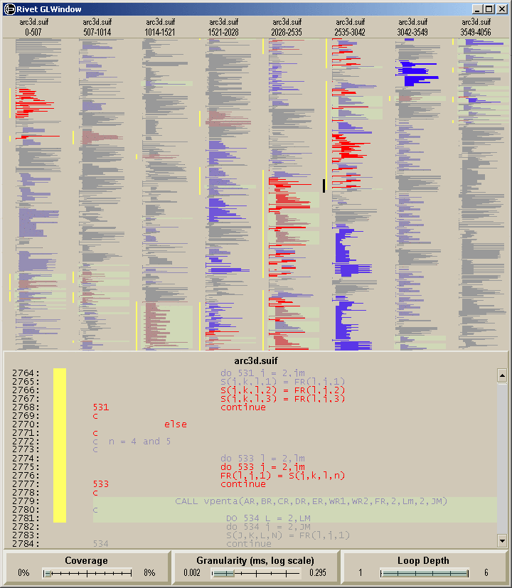
SUIF Explorer: Interactive parallelization
An important area of compiler research is the field of parallelizing compilers, which enable standard sequential applications to run on multiprocessors. With larger-scale machines becoming more widely available, the potential benefits of parallelization is growing rapidly; however, so is the challenge of generating code that realizes this potential. This visualization, part of the SUIF Explorer system, combines a bird's-eye code overview (based on the SeeSoft system) with a detailed source code view. Three range sliders enable the user to interactively filter and highlight interesting sections of code. Lines are color-coded according to the dynamic execution analysis results, emphasizing sections of code would most benefit from user analysis. For more information see our paper in PPoPP 1999. |
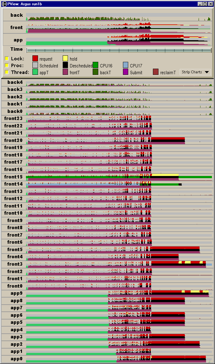
Ad hoc analysis and visualization
Because of the complexity of computer systems, the analysis process is a highly unpredictable and iterative one: an initial look at the data often ends up raising more questions than it answers. In many cases, a series of several data collection and analysis sessions are required to locate the problem and focus in on its underlying causes.
In such an environment, analysis and visualization tools must be broadly applicable to a range of problems, as the demands placed on them can vary greatly not only from task to task, but also from iteration to iteration within a single task. Rivet provides a single, cohesive visualization environment that is well-suited for this iterative process: it can be readily adapted to the varying demands of the computer systems analysis, enabling users to learn the system once and apply that knowledge to any problem. This detailed case study shows how we used Rivet together with SimOS to improve the performance and scalability of the Argus parallel graphics rendering library. The analysis of Argus required a sequence of several simulation and visualization sessions, with each visual analysis suggesting changes to either the data collection in SimOS or to the Argus application itself. In the end, the analysis uncovered a subtle performance bug within the operating system that was limiting the application's performance and scalability. For more information see our paper in HPCA 6. Relational database visualization* The Polaris Project has its own web page now. *
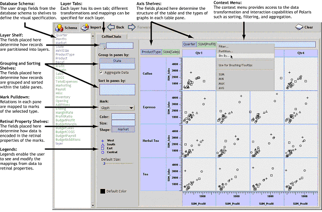
In recent years, large multi-dimensional databases have become common in a variety of applications such as data warehousing and scientific computing. Analysis and exploration tasks place significant demands on the interfaces to these databases. Because of the size of the data sets, dense graphical representations are more effective for exploration than spreadsheets and charts. Furthermore, because of the exploratory nature of the analysis, it must be possible for the analysts to change visualizations rapidly as they pursue a cycle involving first hypothesis and then experimentation.
We have developed Polaris, an interface for exploring large multi-dimensional databases that extends the well-known Pivot Table interface. The novel features of Polaris include an interface for constructing visual specifications of table-based graphical displays and the ability to generate a precise set of relational queries from the visual specifications. The visual specifications can be rapidly and incrementally developed, giving the analyst visual feedback as they construct complex queries and visualizations. For more information see our new webpage. |